osso architecture

logotype + identity elements
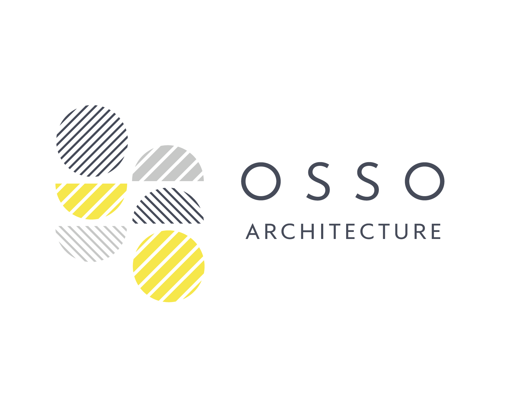
This project was an identity system and custom logo for an architectural firm based in NYC, designed in 2017. The name was carefully chosen by the clients to combine the letters of their last names into a shape which has symmetry and asymmetry at once, and makes use of the elemental circle form, comprised of a full circle for the O and half circles for the S. The logoype is based on the forms of the Mallory typeface from Frere-Jones Type, as this has a strong geometry to it, but with subtle changes to make the O more circular and true to its elemental form. The mark is an abstracted O and S, and is intented to convey the sense of movement, airiness, texture and playfulness that the duo aim to espouse in their work. The hatched texture evokes the architectural visual language of hatching to suggest different surfaces and denote different kinds of areas within a design. Because the duo work as a unit but will often take the lead on one project or another, the business cards reflect this interchangeability, incorporating the forms of the logo into the letters of the last names.